Websites
We have produced close to 200 websites. Below is a small sampling. Click any box to see more details for each project.
Show Categories: ArtsConferencesConservationEducationEnvironmentHealth and wellbeingNonprofitOtherProfessional services
Show Features: BlogCalendarCustom databasesE-newslettersImage slidersMulti-user managementMultilingualOnline donationsOnline formsPackagingPassword-protected pagesPhoto albumsPortfolioRss feedsShopping cartVideos

EV Charging Summit
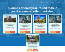
Social Media Strategies Summit
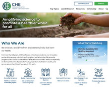
Collaborative on Health and the Environment

Bainbridge Community Foundation

A Better City
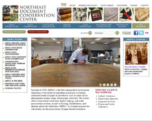
Northeast Document Conservation Center
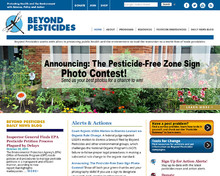
Beyond Pesticides
Razia’s Ray of Hope
East Boston Neighborhood Health Center
Holistic Health Community
Beyond Conventional Cancer Therapies
Digital Design Group
Acadia Getaway
Green Chemistry and Commerce Council
OmniBlue Minerals
John Blake, Jr.
Belinda Berman-Real, M.A., M.F.T., C.S.A.T.

Amygdala PTSD Conference
EV Charging Summit
- blog
- custom databases
- online forms
- password-protected pages
- videos
- calendar
- multi-user management
We do a lot of work for GSMI (Global Strategic Management Institute), which puts on many different types of conferences every year. We have created a sophisticated content-management setup with many linked and automated features to make creating new yearly conferences efficient and user-friendly so that the staff can do almost of the the updates themselves. We also set up a related blog in Wordpress, which dynamically links to the main site to pull information about the current conference.
Click to view sample pages:
Social Media Strategies Summit
socialmediastrategiessummit.com
- blog
- custom databases
- online forms
- videos
- calendar
This is a series of social-media-related conferences for GSMI (Global Stategic Management Institute). Each year features several conferences, each with a different theme. All conferences are managed through a single installation of MODX, making creating, duplicating, and archiving individual conferences easy.
Click to view sample pages:
Collaborative on Health and the Environment
- blog
- custom databases
- online forms
- password-protected pages
- calendar
- multi-user management
- rss feeds
We were hired to do a complete redesign of this website. Our challenge was to come up with a site structure that makes it easy for visitors to find what they are looking for, and an intuitive content management system to enter the great variety of content and link related content together. The site is packed with information, including over 4,000 pages, a searchable toxicants and disease database, and a member/partner database of over 5,000 participants. We came up with creative ways to pack large amounts of information on each page, including fly-out details, expandable sidebar blocks, scrolling areas, and an auto-numbering popup footnotes system, all easily and intuitively set up in the content management system. It was rewarding to see our client astounded by how little they had to do compared with their old content management system, allowing them to focus much more on their work rather than struggling with a cumbersome CMS.
Click to view sample pages:
Bainbridge Community Foundation
- blog
- image sliders
- online forms
- videos
We built this site for a nonprofit community foundation. They needed an inviting design, intuitive navigation, and easily managed content. We created a custom content management setup that includes individual home page banners that can be programmed to appear and go away on a preprogrammed schedule, custom widgets for the right sidebar, full-width header images that can be global per section or selected per page, and typography that matches their branding.
Click to view sample pages:
A Better City
- blog
- image sliders
- online forms
This client hired a designer to create visually rich designs for their new website and printed materials. Our job was to take the provided design skeleton and create an easy-to-manage, completely modular content management system, along with a fully mobile-friendly version of the design. We designed the CMS so that our client can easily add, delete, and sort the horizontal sections of each modular page. The scripting also takes the large, high-quality images and automatically creates multiple versions, using current responsive image techniques to load the size most appropriate for the particular device being used to view the website. We’re very happy with the systems we created, which are now part of our bag of tricks for upcoming websites.
Click to view sample pages:
Northeast Document Conservation Center
- blog
- custom databases
- e-newsletters
- image sliders
- online donations
- online forms
- password-protected pages
- photo albums
- shopping cart
Founded in 1973, the Northeast Document Conservation Center is the first independent conservation laboratory in the United States to specialize exclusively in the conservation and preservation of paper-based collections. NEDCC provides professional conservation treatment for books, maps, photographs, documents, parchment, papyrus, manuscripts, architectural plans, and works of art on paper. NEDCC treats many highly significant paper and photographic objects and continues to be the premiere center for the most difficult conservation challenges.
NEDCC approached us to create a site rich in high-quality photographs to showcase their work. The site structure is very deep, containing a wide variety of educational materials and a number of different "home" pages for different sections of the site. We also created a custom shopping cart system so that people can sign up for educational webinars online. All event registrations, email list, and donations are managed through a custom backend inferface we created.
Click to view sample pages:
Beyond Pesticides
- blog
- custom databases
This website is a treasure trove of information about pesticides, including safety and health issues, legislation, programs around the country, environmental effects, and alternatives to toxic chemicals. Their goal is to protect healthy air, water, land and food for ourselves and future generations.
We created the previous Beyond Pesticides website way back in 2011 in Dreamweaver, and have now converted it to MODX. There are literally thousands of pages on this site, so we created some sophisticated scripting to import all those pages into MODX and update the various links to keep everything working.
We've created various interactive features for the website, including searchable databases for pesticides, food, pests (a great place to find out how to responsibly manage your own garden), and environmentally-conscious service providers. Now that everything is in MODX, it will be far easier to implement the various interactive features they have been wanting to add.
Click to view sample pages:
Razia’s Ray of Hope
- blog
- custom databases
- image sliders
- online donations
- online forms
- photo albums
- shopping cart
- videos
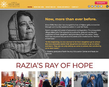
Razia’s Ray of Hope Foundation is a nonprofit organization that empowers young women and girls in Afghanistan through community-based education. Founded on the belief that education is key to positive, peaceful change for current and future generations, they provide young Afghans with the opportunity to learn and grow in a safe, nurturing environment, so that they may work toward brighter futures — in their own villages and beyond.
This website uses a wide range of technologies to engage viewers, including videos, photo albums, online donations, online product purchasing, a virtual tour, and high-quality photos on every page.
Click to view sample pages:
East Boston Neighborhood Health Center
- custom databases
- image sliders
- videos
- multilingual
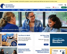
Since 1970, the East Boston Neighborhood Health Center has operated 24 hours a day, 7 days a week. Today they are the only health center in New England, and one of the few in the country, to provide continuous care. Provide easily accessible, affordable, appropriate, high-quality, personalized, coordinated primary care for all who live and work in East Boston and the surrounding communities, without regard to age, income, insurance status, language, culture, or social circumstances.
This website gave us the opportunity to utilize the multilingual capabilities of MODX. Every page on the site has both English and Spanish versions. The Spanish version sits in a completely different page tree in MODX, so it's possible to have a completely different menu structure for each language if desired. Pages retain their links to the corresponding page, wherever it is on the site, making for very easy setup and management of translations. There is no limit to the number of secondary languages that can be used.
Click to view sample pages:
Holistic Health Community
- image sliders
- calendar
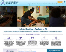
This nonprofit alternative healthcare group needed a new website to enable easier editing of their content and to allow for any future expansion of needed features. We designed the site and set up the MODX CMS to make it easy to manage the lists of practitioners, modalities, and events, linking it all together to make it easy for visitors to navigate the site and cross-reference the information provided. The also wanted something other than just static photos in the headers, so we created a combination of photos, videos, and cinemagraphs to use in the headers to create some dynamism on the site.
Click to view sample pages:
Beyond Conventional Cancer Therapies
- blog
- custom databases
- multi-user management
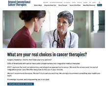
We were hired to create a website providing information about alternative cancer therapies. The idea was to have a central place people could go to find out about all the current therapies, with lots of in-depth information about each one. The information provided is suitable for everyone, from casual readers through researchers. We created a full-featured backend where the client can update pages, add therapies, categorize data for the search screens, cross-link related information between pages, and link to related external news sites. The client wanted a site that is visually uncluttered while at the same time being easy and intuitive to navigate. The current site is a first step, and will expand to provide more information, including facilities that provide treatments.
The challenge here was to create systems to present the stagggering amount of information on each page in a way that doesn’t overwhelm the viewer. We created a custom footnotes system that makes footnotes easy to enter and hides them on the front end until clicking the footnote numbers, sidebar boxes that optionally can be collapsed initially and expanded on clicking a link, “read more” links in the text that open hidden blocks of descriptive text, sidebar boxes that remain tied to the correct text regardless of screen width, and icon-based navigation at the top of long pages to let viewers jump to particular sections on the page, and large quotes that move out into the left white space on larger screens.
Click to view sample pages:
Digital Design Group
- portfolio
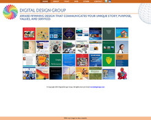
Digital Design Group (formerly Desktop Publishing & Design) is one of the oldest desktop publishing firms in Boston. We've done a lot of work for them over the years. For their website, they wanted to highlight the visuals of their work rather than be primarily an information site. We created a system in MODX to make it easy to enter samples and easily link them together in various ways (alone, several on one page, or several different groups on one page). Each sample uses simple graphical icons to indicate award winners and/or downloaded PDFs associated with the project.
Click to view sample pages:
Acadia Getaway
- custom databases
- photo albums
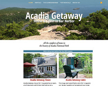
We updated this site from the version we created several years ago to a more modern, fully responsive website. The idea was to create a simple design to make it easy for visitors of all ages to find the information they need and see the offerings available using high-quality photographs, both in the photo galleries and large header images. We created an intuitive, database-driven availability calendar on the backend to make it easy for the client to simply checky of the status of each week as it gets booked or put on hold, and the web page uses a script to create the visual calendar for visitors to instantly see what weeks they can choose from. The spaciousness of the design, combined with large images, makes for a very inviting experience.
Click to view sample pages:
Green Chemistry and Commerce Council
- custom databases
- e-newsletters
- image sliders
- password-protected pages
- videos
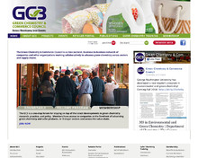
The Green Chemistry and Commerce Council (GC3) is a business-to-business forum that advances the application of green chemistry and design for environment across supply chains. It provides an open forum for cross-sectoral collaboration to share information and experiences about the challenges to and opportunities for safer chemicals and products.
The website features lots of database-driven interactivity, a password-protected members section, e-newsletters, and informative archived webinar material.
Click to view sample pages:
OmniBlue Minerals
- blog
- custom databases
- shopping cart
- videos
- packaging
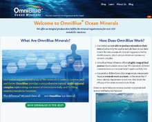
This client was using a shopping cart service to create their website, and was tired with all the limitations. We designed a new site, implementing the client’s vision for the unique type of home page content. We created a custom on-site shopping cart to manage orders, complete with live link to their shipper for inventory and shipment tracking. The system includes a custom “Affiliates” setups as well as variations discounts and promotions. We also design and produce labels for all their products.
Click to view sample pages:
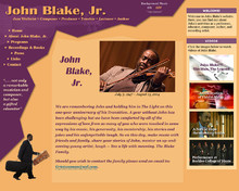
John Blake, Jr.
- custom databases
- image sliders
- videos
The well-known jazz violinist, John Blake Jr., asked us to design a site for him to showcase his educational programs, performance schedule, and discography. We created a simple backend through which he could manage his schedule and make basic edits to the website. Unfortunately, John passed away in 2014, but we still maintain this site to keep his legacy alive.
Click to view sample pages:
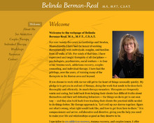
Belinda Berman-Real, M.A., M.F.T., C.S.A.T.
This Boston-based therapist enlisted us to create a very simple, zen-like website where she can promote her private work and workshops, and also integrate her Amazon book list. We also created business cards based on the website design.
Click to view sample pages:
Amygdala PTSD Conference
This client wanted a website that matched their promotional materials closely (brochures, flyers, etc.) and an easy-to-update content management system. We used a simple design, using their background color and typography styles, combined with popup bios where appropriate.
Click to view sample pages:


