Print Design
Below is a small sampling of the hundreds of books we have produced.
Click any box below to see more details for each project.

American Aria — Encore

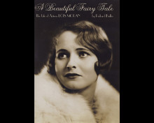
A Beautiful Fairy Tale

Sibelius Music Notation Software Manual

Land Market Monitoring for Smart Urban Growth

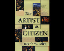
The Artist as Citizen

James Bond FAQ

European Spatial Planning

Zubin Mehta — The Score of My Life

Food and Nutrition Bulletin, 1997–2015

Classes in Classical Ballet

Schumann — A Chorus of Voices

Desktop Mastering

Frontman

Pro Tools Surround Sound Mixing

Charles Ives and Aaron Copland

The Mahler Symphonies

The Global Epidemiology of Infectious Diseases
American Aria — Encore
- book design
- cover design
- photo retouching
- indexing
This book is an autobiography of Sherrill Milnes, one of the foremost operatic baritones of his generation. Due to the length of the content, we created a design that was somewhat compact while still maintaining elegance, combined with chapter opening titles that command attention, as befits the subject matter. The book includes two sixteen-page, high-quality, glossy photo insert sections, and two appendices. We also created the cover design and did the indexing.
Click to view sample pages:
A Beautiful Fairy Tale
- book design
- photo retouching
When Limelight Editions approached us to design this book, we knew at once that an elegant treatment would be needed. Gorgeous typography, delicate details, and understated chapter titles contribute to the overall feeling of beauty of intimacy.
Click to view sample pages:
Sibelius Music Notation Software Manual
Hal Leonard Books approached us to produce an updated version of this software manual. Our task was to create new templates in InDesign, import all new copy and graphics, and lay out the book in such a way as to optimize the output for conversion to ebook as well as printed copies.
Click to view sample pages:
Land Market Monitoring for Smart Urban Growth
- book design
- charts
- copy editing
- cover design
- illustrations
- tables
This book was produced as a followup to a conference. It features many tables, charts, diagrams, and other graphics. We handled the entire project, including book and cover design, copy editing, illustrations, and other graphics. It is design to be a source of information regarding the prevention of urban sprawl, integration of transportation and land use plans, provision of affordable housing, protection of open space, and timely and efficient provision of urban infrasctructure.
Click to view sample pages:
The Artist as Citizen
- book design
This is a custom book design we did for Amadeus Press. It is a compilation of Joseph W. Polisi’s articles and speeches from his two-decade tenure as president of the Juilliard School. We choose to do a classic design, combined with chapter opening pages with special type treatments for the titles, to create a spacious, readable book.
Click to view sample pages:
James Bond FAQ
- book design
- photo retouching
All That’s Left to Know About Everyone’s Favorite Superspy
Part of the FAQ series we designed for Hal Leonard Publications. Includes biographies, synopses, production stories, and images and illustrations seldom seen in print.
Click to view sample pages:
European Spatial Planning
- book design
- charts
- copy editing
- cover design
- illustrations
- tables
This book explores the implications of recent European innovations in spatial planning for the United States, and proposes solutions to the problems of congestion, sprawl, environmental degradation and economic decline in many areas of the country. There are many detailed maps, and the book features an insert of color plates showing these graphical maps in all their glory. The black and white versions scattered through the book refer to the version in the color plates for those interested in seeing the corresponding map in more detail.
Click to view sample pages:
Zubin Mehta — The Score of My Life
- book design
- photo retouching
We used a relatively straightforward, classic design for this autobiography of Zubin Mehta, one of the most renowned conductors in the world. It's a hard-cover book with traditional thick, pleasant-feeling paper plus a sixteen-page high-gloss photo section in the middle.
Click to view sample pages:
Food and Nutrition Bulletin, 1997–2015
- book design
- charts
- illustrations
- photo retouching
- tables
Since 1987, this journal has disseminated the most cutting-edge work that is being done in nutrition research and food policy to alleviate malnutrition and hunger in the developing world. In 1997, we were given the task of converting the journal, which had been produced using old-fashioned typographical methods, into a digital format. We duplicated the style and typography as closely as possible, setting up templates in Pagemaker. Several years later, we converted the templates to InDesign when this software became our publishing platform of choice. We used Illustrator to recreate all charts, diagrams, and other graphics so that stylistic consistency is maintained across all authors and all issues. Articles were often rich in data, employing tables and figures of varying degrees of complexity to present this information as clearly as possible.
Alas, the journal lost its primary funding sources in 2015 and was sold to a different publisher, and the emphasis has shifted to an online format.
Click to view sample pages:
Classes in Classical Ballet
- cover design
- photo retouching
Hal Leonard Publications wanted to print an updated version of this classic manual of classical ballet created by Asaf Messerer, a founder of the Bolshoi School of Ballet. The task was to design a new cover and include a new foreword, along with a few pages of corrections throughout the book. Published in 1972, the original version was not digitally typeset. It was challenging to match the typography as closely as possible, since the bulk of the book would be printed from scans of the original rather than from digital files. Since the book is about exercises and is filled with photos of dancers training in the studio, we wanted to use a photo of a dancer training on the cover rather than a performance photo. We located a stunning photo of Bolshoi Ballet star Svetlana Zakharova and designed the cover around it.
Click to view sample pages:
Schumann — A Chorus of Voices
- book design
- photo retouching
This book is a compilation of interviews done by John C. Tibbets of the University of Arkansas with a number of individuals from different fields who offer their own distinct perspective on Schumann’s life and work. The challenge was to visually distinguish the various elements — interviews, editor’s notes, and the occasional dialogue among multiple individuals. The book is also quite long (over 500 pages), requiring a fairly tight typographical treatment. Photos are interspersed throughout the text.
Click to view sample pages:
Desktop Mastering
- book design
- photo retouching
For this software manual, we created a straightforward design in order to not complicate the layouts, which are filled with screen captures and other graphics. The book is a large size, in keeping with similar books in Hal Leonard's lineup. The size allowed us to use certain images full-width in order to display details that would be lost at a smaller size. We also employed certain layout techniques to optimize export to ebook format.
Click to view sample pages:
Frontman
- book design
- photo retouching
This book is an autobiography of acclaimed recording artist, performer, composer, and producer Richard Barone. We used typography that created a flowing, easy-to-read, and friendly feeling to compement the conversation tone of the manuscript. There is also a glossy, color photo insert. We took great care with the photo preparation to correct colors, improve detail, and even remove unwanted elements from some photos.
Click to view sample pages:
Pro Tools Surround Sound Mixing
- copy editing
- photo retouching
Hal Leonard Books hired us to produce the second edition of this manual. Technology had changed quite a bit in the six years since the first edition came out. There were numerous new photos, screen captures, and other graphics to prepare and optimize for print. The copy was completely replaced, for which our copy editing services were also required.
Click to view sample pages:
Charles Ives and Aaron Copland
- book design
- cover design
Amadeus Press asked us to design a series of books called “Parallel Lives” that compare two composers. This was the first book in the series. The book is set in three parts, with the first two parts each having two sections, one for each composer. There are no chapter numbers, so each section flows from one chapter to the next without a break.
Click to view sample pages:
The Mahler Symphonies
- book design
- cover design
Amadeus Press asked us to design a series of books called “Unlocking the Masters.” This is the first book in the series. The typography creates a simple, uncluttered look. The idea behind the cover design was that each book in the series would use a different color, both fully satured and screened back for contrast, to distinguish them. Photos of the composers were to be converted to a posterized style, using the chosen color plus black.
Click to view sample pages:
The Global Epidemiology of Infectious Diseases
- charts
- photo retouching
- tables
- equations
This book is part of the World Health Organization’s Global Burden of Disease series, for which we produced several books. Charts, tables, boxes, and equations are used throughout the book.
Click to view sample pages:


